RECENT COMMENTS
Joel Cabot on Power Outage on the Hill
Eric S. Huffstutler on What is up with the Church Hill Post Office?
Eric S. Huffstutler on What is up with the Church Hill Post Office?
Yvette Cannon on What is up with the Church Hill Post Office?
crd on Power Outage on the Hill
New rendering for Cedar-Broad
01/29/2009 6:00 AM by John M
Walter Parks gave an overview of changes to the Cedar-Broad development at this week’s Friends of Jefferson Park meeting.
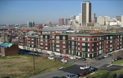
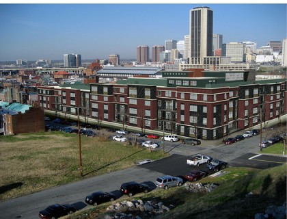
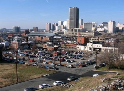
CURRENTLY PROPOSED TOP, PREVIOUSLY ABOVE; CURRENTLY AT BOTTOM
The big change is that the roof-top pool and clubhouse have been removed. Some of the materials planned for the project have been switched out for more economical materials, but this should not be readily apparent. Also, the treatment of the rising wall along Cedar Street has been given windows, both to break up the wall and to provide light&air to the parking under the building.





My God I hate the James Monroe building so much.
As much as I hate surface lots, the architecture is pretty lack-luster. I wish Richmond would take some risks and build forward thinking condo projects instead of rehashing old tired designs. Who wants to live in a VCU inspired dorm/condo building?
looks to be a real neighborhood friendly development. no doors from the apts to the street and walled off from the neighborhood. less than 600 sf apts? what happened to the swimming pool?
#2 “Who wants to live in a VCU inspired dorm/condo building…”
across the street from a baseball stadium?
Just curious, in comparison to its counterpart diagonally across the intersection (i.e. the stadium project), will this development also be financed by a combination of private investments and bonds? Will the Cedar-Broad development rely upon city funds for any utility or infrastructure improvements?
That’s one ugly building. They couldn’t spend a few bucks on an architect? I guess they’re trying to compete with the cookie-cutter tripe that VCU has been puking out for the last few years. Red and green alternating blocks is supposed to convey what, that it’s child-friendly, that they’re ready for Christmas? Surely someone can do better than this.
Yeah the Monroe building is ugly…it’s not much better on the inside. Believe me, I see it every day. Just think it was originally going to be a twin-towered building. So the two tallest towers in the skyline would have both been that ugly. At least all we have to look at is the one.
They need to throw some columns on it-Jefferson Style! Come on, this is the city that time forgot when it comes to architecture. And we shall have no mixed use either! You must drive drive drive!
Who is the developer on this project?
Emerson, the same as American Tobacco.
This project has commercial space along Broad.
600 sq ft… my, that is tiny. I agree, the design could use a bit more style.
The main pedestrian entrance is on Marshall, just off off Cedar, at the foot of the park.
The first 4 ground-level units along Cedar have doors to the sidewalk.
It does look a bit reminiscent of some of VCU’s dorm work along Broad, but I took a short tour of the Walter Parks site in the original post and they’ve done some pretty impressive work elsewhere.
Thanks Paul. Nice site. Their renovation work looks top notch. It would be nice to see the old flare/details of their renovation work incorporated in the project. Something to set it apart.
http://wparks.com/portfolio/project_list.html
Thanks, I put that together 🙂
Well aren’t you a talented jack of all trades!
having some familiarity with WP work, I would say this is not the firms desired design. I bet you this is the developers constantly telling Parks to cut cut cut until you end up with what you see. We should def get on the developer to let Parks loose a little on the “design” of this important building.
Let’s start building it!
VCU dorm style inspired,lol, how bout public building inspired, makes me wonder-is this gonna be a bond inspired-public financed development like the proposed ball park?