RECENT COMMENTS
Eric S. Huffstutler on What is up with the Church Hill Post Office?
lanny on then it happens to you...
JessOfRVA on then it happens to you...
Becky Metzler on Updated! Guess what's happening on Mosby/Venable?
Mary on then it happens to you...
Sid on then it happens to you...
Becky Metzler on Church Hill Startup Tackles Insurance for Freelancers
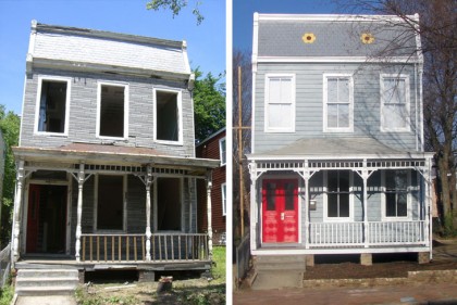
Before & after on 24th Street
02/16/2009 10:05 AM by John M
By Jewels, Inc., the same folks that fixed up the house next door and saved this quad on Carrington, among others.


Bravo – nicely done!
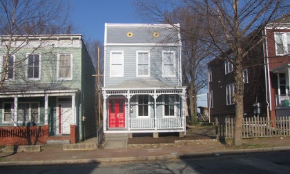
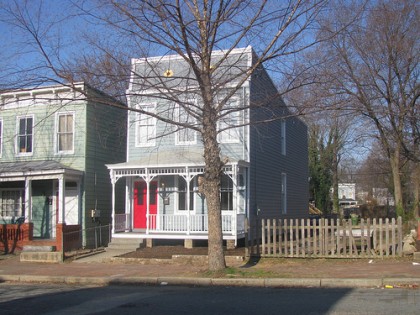
I must say, giving Jewel’s checkered past with restorations, this is one of their better examples. Just looks like with the size of windows on the 2nd floor it seems there should have been longer or even walk-through windows on the 1st floor? Now they need to plant a couple of trees and grass (landscape) to finish it off.
It looks like they replaced/restored the windows to the same size as original.
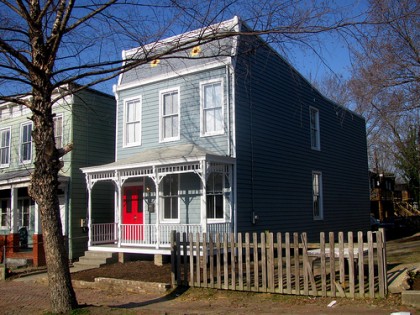
The porch looks especially great & I love the flower detail restored to the roof.
Red doors?!! Does that mean gals can go in for spa treatments? 😉 I bet Tom O’Kelly gives one helluva pedicure.
All kiddin’ aside, nice work, Tom, Julie and everyone who worked on this house. She’s really sweet.
It may simply be an illusion with the porch and the window size (porch hiding part of the window)? Yes, the tiling is a nice original style plus overlooked by many.
one of the better after photos I have seen
Wonderful restoration. Thanks for saving another piece of Union Hill.
Amazing job, Tom & Co. In addition to restoring a beautiful house, I understand you’re also bringing us some great new neighbors. I’m looking forward to taking them a bottle of wine to welcome them to Union Hill!
nice. what block of 24th is this on?
700 block, between M and Cedar Streets
Another plus for Tom O’Kelly on this restoration is the fact that he did not use non-period material or look siding.
Not knowing what was under the tar shingle siding “before”, many people go the cheap and quick route of vinyl siding which has the incorrect spacing. This at least has the narrower spacing which is period to the house and is a detail the eye quickly catches so looks correct. Kudos on that and the mansard roof details! This is how proper restorations should look so get a hint people.
Eric
wow, Eric, you just simply couldn’t suck more. please send the pictures of all the houses you’ve restored to historic perfection. otherwise just thank the folks like Tom with the resources and vision to get involved in such a project
No need to be sarcastic BK and how many houses have YOU done?
Resources and Vision is one thing. Doing them correctly is another! You don’t have to be a contractor to know the difference. Even the C.A.R. Guidelines are being misused by that group but are suppose to dictate what you can and can’t do within the Historic Districts concerning renovations, designs, and materials. They are currently being challenged to change them to be more “historically” accurate in their interpretation – more in line with other historic cities who use the same guidelines.
Eric
those that can, do. those that can’t, review