RECENT COMMENTS
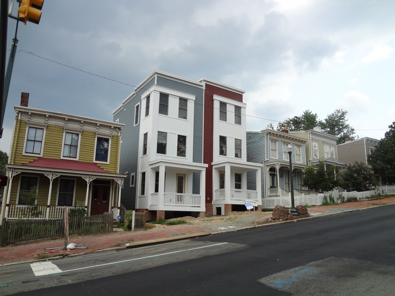
New construction on Broad Street
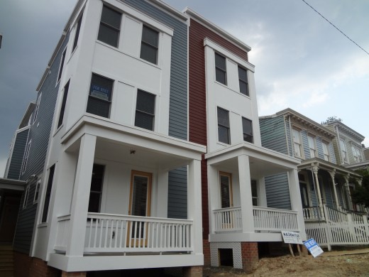
The new houses at 2102-2104 East Broad have been in the works for some time. They first hit CHPN with a mention on the agenda for the October 2008 CAR meeting: “2102 E BROAD ST Construct two new duplexes”. That post attracted no comments regarding these houses.
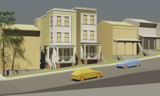
We published renderings of the design in February 2009, and the discussion immediately became about what constitutes appropriate infill in a historic neighborhood: should the designs match existing properties, or is that “phony historicism”. The height of the buildings in relation to the existing houses was also mentioned as a concern. Both of these points of discussion echoed previous concerns surrounding the proposed condos at Oakwood Heights.
The houses went before CAR again in July of 2009 to no apparent controversy. The project went up for a special use permit, to allow for extra height and a larger garage, in February of 2010, to no comment here. A return trip to CAR this past January received more attention.
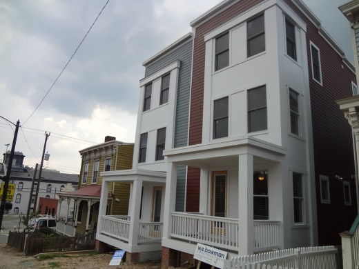
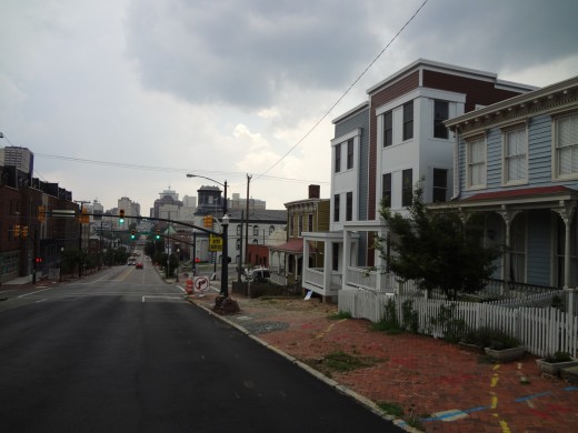
At this time, the construction looks to be fairly complete.


ive only just moved here so i dont know all the past concerning these buildings but i have to say… they are UGLY and out of place. its a shame really. absolutely ugly. every time i drive past i shake my head a little and think “why on earth?”
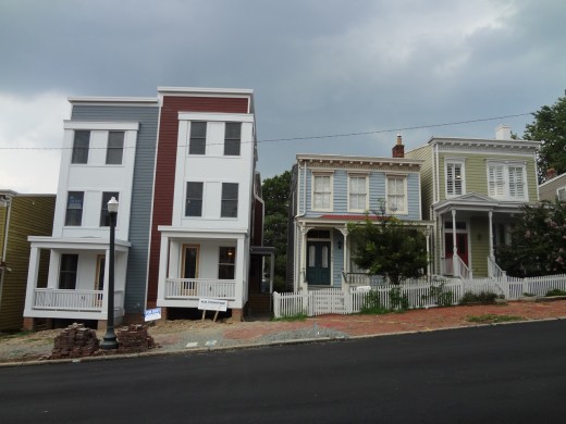
They really do look so ugly! Seeing the renderings next to the finished project makes me think the renderings were misleading… The buildings don’t look quite as much taller than their neighbors as they are in real life, and the white paneling on the front somehow doesn’t look quite as obnoxious.
Thanks for pulling this all together.
The renderings don’t do these justice. Interesting how Johannas chose to portray the neighboring houses as anonymous blobs in that rendering. It makes them blend in much better with his. The scale is only part of the problem. The fact that the style is so starkly contrasting and in your face next to the more delicate stylings of its neighbors makes this especially out of place.
As I mentioned on the earlier thread, am going to be trying to pull together folks to draft a petition to our elected officials highlighting this conflict of interest by a CAR member and its horrid results. Anyone interested in helping draft and/or adding their name, please email me at sox45fan@hotmail.com. It may be too late on these but we can at least try to stop Johannas and Bilder from dropping more architectural waste in our neighborhood by abusing their positions. I’ve got almost a dozen interested so far, would love to get as many as possible.
By the way, I think the lack of comments on the earlier posts is a perfect illustration of why CAR needs more transparency. All we get now is a bunch of noise that stuff is being built. Once it’s clear what it is, people have real concerns.
It’s up now… can’t do anything… I’d like to see a whole neighborhood of these in the city somewhere… but they should have built a replica of the houses already in that block.
Nicely done. It’s been interesting to watch these being built.
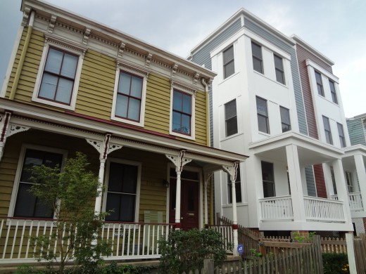
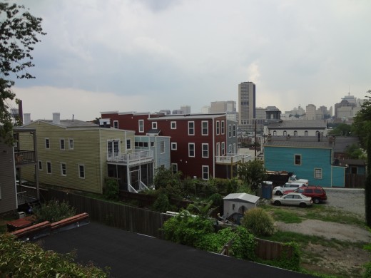
I feel especially bad for the two houses up hill that had their porches completely eclipsed. Before, the slope of the hill allowed everyone a good view.
Also the guy down the hill just got some nice gingerbreading and a classy historic renovation done and then this goes up and his driveway gets blocked for the better part of a year with the great dig.
Been a crappy year for these folks.
The Commission on Architectural Review is a joke.
I kinda like them actually. For all the heat people in the suburbs seem to get for living in “cookie cutter neighborhoods,” people in the city sure do seem to get fired up when something is built nearby that isn’t just like the rest of the area.
While it’s a historic area, much of it is run down and ugly to begin with. This block certainly wasn’t the prettiest one around to begin with. Obviously people are going to have different tastes when it comes to style, but I don’t see what that means everything needs to look the same.
That said, I would agree with those who don’t really approve of the height difference, as that is more than just aesthetics.
My major issue is the color scheme.
I think instead of the stark white, maybe an off-white similar to the color of the trim in the neighboring houses would have been more appropriate.
Also the fact that there are no stairs to the front entrance seems a bit weird and uninviting. Is that not a true front entrance?
#firstworldproblems
I prefer infill and density to sprawl. I think the Historic designation, while I get it in some respects, just serves to slow or diminish forward movement.
zach,
Whether any of us likes them or not is honestly debatable. I think the real issue here is that as you point out is that these don’t fit in. We have a CAR that is supposed to enforce basically just that – that the houses do fit in. The developer of these houses is a member of that board. So the argument isn’t so much about my opinion or your opinion but whether these fit in with the rest of the historic district. It’s about inconsistently applied standards. If we’re going to have a body regulating these types of things, everyone needs to be held to them equally. If you want to argue that CAR doesn’t need to exist, I think that may be an option worth exploring.
#10 Jay has a good point – how do you get into these things?! The rendering shows stairs to the front of the one on the left, and to the side of the one on the right as you face them. I don’t see any stairs at all in the so-called finished (and ugly) product.
Alex, I’m interested in your petition but didn’t Laura Dabb try to do something like that in the last couple of years? I can’t remember the details or results. Not saying you shouldn’t do it, as I do think something like that is called for.
I actually think these are more sympathetic than a lot of other CAR approved projects. I think they treat the scale well – with differentiation from the front. If the developer or the City would plant some trees, and the pea green house to the West got some fresh paint itself (the newness of this against the peeling of the green house is jarring) I think this would blend nicely. A different paint scheme could also really change the whole impression of this project.
what a terrible, terrible design.
It makes me want to take Leigh Street home each day.
Who on earth would design something this blocky and out of scale. And how on earth did this ever get approved??
I feel so sorry for the people in the beautiful houses adjacent to this.
These are fine and beat vacant lots by a mile. The “nuclear winter white” edifice will tone down with the help of some city traffic and soot. I’m grateful people are still investing in our neighborhood. That’s more than can be said for many parts of the region.
The earlier post was correct. The renderings were very misleading. The existing building should have been modeled more accurately. CAR and the designer should have been very aware that a 12″x12″ porch column would look very out of place next to a well proportioned 4″ round turned column. And that’s just one example. Shame on them for letting this happen. Now we all have to suffer the consequences everytime we drive past this monster.
the front on these new structures was previously painted a brownish-tan color, which was recently painted over with white. i could be wrong, but this white may just be primer as they decided to change the brown to a new color (i hope so, as the bright white is jarring).
Quit your complaining. It was tastefully done. We need more people doing things like this in the neighborhood. Also, it wasn’t painted brown before, that was the color of the material, the white is the finish color. Bright white on the exterior of anything doesn’t stay bright for long.
alex-
yeah fair points. i guess i’m mostly against having guidelines like that applying to vacant or blighted properties, but that isn’t really relevant to this discussion. didn’t mean to veer things off on a tangent.
They are a welcome addition to the neighborhood. Haters gonna hate.
I think they look really unique and a like that. I love my house, but there are 1,000 in church hill that look just like it. Even if this duplex isn’t exactly what I would call beautiful, it is unique and I think that is more important in some ways than beauty, assuming it isn’t repulsive, we’ve got plenty of beautiful houses along Broad, but not enough quirky neat ones. I like them.
#12 – The developer/owner is not on the CAR and has not ever been on the CAR. Check some facts before you start typing
#23-this is a johannas project… Johanna’s is on CAR.
I can appreciate that some people are in favor or unique.
I can appreciate that some people like new construction in lieu of empty lots.
But this is just poorly designed and out of scale.
You can be unique/different and still be a well designed building.
Unfortunately for all of us, we now have to live with the fact that someone decided to build something that was still in schematic design, and decided to ignore all sense of context and scale.
Shame on them and CAR.
@23 – maybe you should follow your own advice. Check the CAR transcripts and it’s clearly called out that Johannas was involved with this. His website even lists this as one of his projects.
http://johannasdesign.com/HDinfill1.htm
For all those saying that they like these things, you’re entitled to your opinion and I won’t try to argue that.
However, I have a few questions for you:
1. Would you say that these houses…
“…respect the prevailing front and side yard setback patterns of the surrounding block.”
“…maintain the existing human scale of historic residential and commercial neighborhoods. (The inappropriate use of monumentally-scaled buildings that overwhelm pedestrians at the street level is strongly discouraged.)”
“…respect the typical height of surrounding houses and commercial structures.”
2. Would you feel that a group of your co-workers would give the same judgment that they would to someone they don’t know? What about if they knew you had a lot of money at stake?
3. Do you feel like you can easily tell what is being built in your neighborhood before it goes up right now? How much time does it take you to get a good sense of what these buildings will look like in advance right now?
If your answer to any of the above is honestly “No”, then hopefully you’ll get what the real concerns are here. It’s as much about the process being broken as it is a discussion of aesthetics.
Straight from the Johannas website:
“We approach each project with an explicit goal: to be responsive to our client, the context, the community and the environment.”
Responsive to the community and context??
I believe it’s time they craft a new mission statement.
Rabble, rabble. Rabble-rabble. NIMBY!
I regret to admit that I too just moved to the area after the approval of the plans and have driven past this every day only to find it a giant eye-sore. Definitely has inspired me to get more involved in the community.
@29 – that’s kind of the point of a historic district…
well said #31
That may very well be why the time has come to give up on the idea of a perfectly preserved “historic district” at the expense of progress.
Every single neighbourhood in Richmond with potential for increased density and, subsequently, increased livability sees NIMBY resistance in the name of preservation of historic character.
The question I have for the Alexes of Richmond is this: Do you wish Richmond to languish in the mid-20th century, with the majority of people not interested in living in the inner city and instead living in the suburbs, or would you like to see the city thrive, reverse the white flight of the 80s, and see both commerce and resettlement of the city core continue? If the answer is the latter, then some compromise is called for. If it’s the latter, then I suppose everyone should continue the NIMBY crusade unabated.
Architectural discussions are great because it shows how powerful architecture is in affecting everyone who lives in/ looks at/ walks next to buildings. They’re also great because it becomes evident that almost everyone can agree on what makes a great design. It’s all about scale, mass and aesthetics. The first two are fairly easy to agree on…the third, well that’s another story. So throw out the color of the house because that’s only skin deep. This house suffers from a couple things, and while the scale is not perfect it’s more about the mass/volume. The house is essentially a cube with few setbacks, filling out every bit of its volume. For instance, most of the older homes in the area have a step back for a side porch. It doesn’t seem like much but this is just enough to break up the visual monotony. This house also lacks any texture…in that what you see is what you get, no matter if you view the house from 50 feet or 5 feet away. On any building with well designed detail you will get a gradually richer experience the closer you get….on our homes it’s the porches that draw you in, and then you notice the shape of the columns, then the “gingerbread” details and intricate dentil molding. Here you’re not rewarded in any way by standing right up to it….it’s just, well, a whole lot of OK. Would neighbors go for as many evening walks around houses like this? Maybe, but I think perhaps no, as for me those walks are always an excuse to feed my eyes with something beautiful, something exciting, and something I might discover upon “closer inspection.” And details don’t need to be gingerbread woodwork…it can be a carefully crafted reveal between the column and porch floor, an intricate pattern to the wood under the porch roof, a stained glass window for passersby to see. There are a couple great infill houses in the area that do have the same effect of drawing you closer that the older homes have.
What would have been nice on this one:
Not having the two halves flush in the front…offsetting one just a little could have helped
Some carefully crafted details to experience from closer up
Not using the entire volume of the cube, but adding some setbacks which would create opportunities for side porches
Just my two cents. It is nice to see investment on this very ugly block though, an ugliness my wife and I are trying to fix since we purchased a house on this block a couple years ago.
This place was historic a long time ago, like when my great grandmother grew up here. Now, it’s historic in the amount of complaining people do over a freaking house design. How about focus on real issues like the poor, drugs/alcohol abuse, panhandling, litter, blighted properties, horrible schools, etc, etc and so on that exists in this area. So much work to be done and so much energy wasted on complaining about stupid stuff like this. So sad.
@33 – to be clear, I have no problem scrapping historic district designation if that’s what folks want around here. My problem is having standards that are one way for the little people while CAR members play by another set of rules. The same folks that tell the rest of the neighborhood what color to paint their house should be held to a higher standard, not a lower one. If we’re going to let shit like this through, let’s admit that the system has failed and drop the whole charade.
@35 – poor construction may seem trivial to you but it does have a serious impact on the value of surrounding homes. I’m willing to be that the houses next to this probably lost thousands of dollars in value when this went up. I guess it wouldn’t bother you if someone caused your home price to drop that much but for some, this is a big deal.
Also, while it may be hard to see with that building blocking everything, this block actually does still have some historic homes left. In fact that entire row was a nice stretch of well preserved Victorian homes. Some folks do like that stuff, even if it’s not your style and there are few places left where this can be found.
IMHO: Whether I like what was built on this block or not is a moot point. What is at issue is the unfairness of CAR. My house had to be built so that it was the EXACT SAME height and the exact same set back as those on the block. I was allowed no “modern” sized or shaped windows. The only acceptable door on the front had to be four panel wood. This was all non-negotiable. So CAR designed my faux historical house. When I see what has been built near my block, and this duplex above, I get angry. Why the discrimination?
Glad things are being built, but the design could have at least incorporated some elements from surrounding buildings.
@38 – see earlier posts. Why the discrimination? Simple – you aren’t a CAR member. They get to do what they want. Would love to hear more about you situation as I think it would be a great illustration of how broken this process is. Can you email me at sox45fan@hotmail.com.
very well said #34
zach… I had to answer once I saw your comment that the area is ugly and run down. First, it is “historic” and that said is OLD and noted such as having one of the densest 19th Century architecture in the country. And our neighborhoods are on National Historic Registries. Problem is that people don’t or won’t take the time to invest in these older properties and do correct restorations. Ugly… in the eye of the beholder but we are talking about 100+ year old buildings.
That said, yes the CAR is a JOKE and I can not imagine how they see that this “fits in” with the surrounding architecture per the rule book they are supposed to abide by? The whole atrocity sticks out like a sore thumb and goes against everything the CAR is supposed to stand for. I can go through their O&H book and point out one after another misstep with this whole project and the other will be pointing at Johannas! You figure out which finger.
Any NO, we do not get adequate notice to voice comments or make suggestions. These plans slip under the radar and started before anyone knows what is happening and this has happened more than once. That is the way they plan it. You can’t say that they announced it on their website – how many people go there or knows about it? Plans should be published in high profile areas like newspapers and this website (among others) as well as notices sent out to adjoining block neighbors. I seem to recall getting alteration notices for a building only a couple doors down years ago… nothing of the likes now???
Zach #9, I, too, have to take issue with your comments: “While it’s a historic area, much of it is run down and ugly to begin with. This block certainly wasn’t the prettiest one around to begin with.” I disagree, this block was pretty well restored at least on this side of the street, until this came along. I think the addition is truly ugly.
I’ve also finally figured out how to enter the building. The porch we see in the front is for looks, it seems; the stairs to get in and a small porch are located set back on both the left and right sides of the building. They are just not visible in the photos here.
Both the design and material selection are poor but it could be worse.
KC… yes, but not sure how much worse? It is like a spaceship landed between Victorian houses.
I know that this was in the works years ago and was given a chance to review then but the problem is people not wanting to stand up for what they believe in and fight City Hall. One or a couple of voices will NOT be heard by them… strength in numbers is what we need to make changes with the C.A.R. ! Other cities have done it so why can’t Richmond?
is there any way to get CAR to respond to some of the comments that are posted here?
What’s going to keep this from happening again?
Does CAR see this project as an example of what they ‘preach’?
How can they make me get approval of a paint color when they allow this to happen?
CAR? are you out there? answers please…
@42 and @43
i probably did come off a little too harsh in my opinion of the block/area. that said, i still think it’s an improvement over a vacant lot.
and for the record, i’m almost always in favor of “correct restorations” of existing properties or new construction that more or less fits in with its surroundings, but absent someone doing that i’m open to giving a lot more leeway.
Just throwing this out there objectively, perhaps the reason not enough people are fighting City Hall on this topic is because there’s no interest or perhaps the non-participants actually support the development. I understand there are a handful of residents who do feel passionately about this and they have the right to their opinion. In viewing this post and many similar other posts on here, I could probably count a dozen to two dozen residents who feel strongly one way or the other. Church Hill is full of several thousand residents, perhaps the rest don’t care or have expressed their opinion by not getting involved.
I associate with probably 20 or so people that live in Church Hill and the topic of this house has come up in several discussions. They all feel as disgusted by this project as I do. They just don’t voice their opinions on here (surprisingly, many did not even know this website existed)
Magneto… You have hit on a couple sore spots when it comes to local participation concerning preservation.
Yes, CHPN is not a true gauge to find out who is or is not in favor of something as there are only a few regulars here. But in general, there had to be some real interest when our neighborhoods were designated as protected National Historic Districts years ago.
I think the real problem is that people feel like the battle is lost before the fight. That City Hall will end up doing what they want to do in the long run no matter what people say so why bother? And “if” that is the true reason then people deserve what they get and have no right to complain. But I have noted in the past cities like Savannah, GA took a stand with a 200+ person turnout to fight against their own CAR group when it came to improper decisions. It does take some education. It also takes exposure to educate. But if people want to bark and not bite then nothing will get done and that would be a shame since we have such riches in our neighborhoods.
When I was much younger in the 1960s, we all believed in everything NEW and dreamed of the future. I wouldn’t mind if there was some really radical chrome and glass high-rise building designs in our city – futuristic and artistic but no one wants to push that envelope and we end up with blah looking buildings or something that looks cheap, almost like a kids fort or tree house rather than a home as with this 2100 Broad project. A complete lack of imagination if they wanted to go against the grain when it came to what the guide book says about new infills. But within “Historic” districts we have no use for such architecture. It is supposed to “balance”, work in harmony with its surrounding designs. There is absolutely zero that looks like this quadplex in its immediate vicinity and that shows with these photos. It is abominations like this which we should take a stand against. I can cite proper additions or new infills designed by others than Johannas but it seems like he is a one-man show in trying to overthrow Old and Historic and infiltrate with Modernistic Contemporary. A personal agenda called $$$
Eric
#43 cdr… I just now noticed after passing by this monster that there is no proper “front door” entrance. What gives? It shows up in the proposed design but if you can’t even place a formal front door on the building, I would hate to see how the inside is laid out! Have to make your guest shimmy between two buildings to get inside?
@48 – I think you’d be hard pressed to find anyone in my block that supports this building. Of course, we have to live near it so we may be a bit biased.
The folks on the other side of the hill may find this design to be quite refreshing. I know if the situation were reversed, I would care a lot less if this was going in by Chimborazo. Unless I understood the backstory and why this represented a clear abuse of power, I probably wouldn’t even find it worth my time to comment.
For example, I think the new Shockoe Valley lofts are quite possibly even more unsightly than these. Am I rushing to Shockoe news to post this? Unless it turns out that this involved some backdoor lobbying to accomplish, I could care less to get involved.
I think a better question is whether anyone in the immediate area finds these to be anything other than inappropriate at best? Surely I’d hope so, since that it what CAR is supposed to prevent against. Based on the offline discussions, it doesn’t appear to be that way.
Anyone here own a historic home near these things that is excited about them?
Alex, per Johannas link, you can see they have the skill and ability to do the RIGHT thing when it comes to designs. Not everything they have done includes modern roof tops or a mix of designs with additions. But in general their track record is not good.
wow, you’re right Eric.
no front entry. How strange.
“mom, just park and then walk in to the dark alley between the houses. I’ll let you in”
That can’t be good from a security perspective either.
But then again, this house has much bigger issues than a missing front door.
(how sad is that? that there could be a design flaw that trumps not having a front door!)
Actually there is a front door, on both sides, but it’s way recessed. You have to stop and look at the sides and see the small porch, it’s there to the left and right of the house. But I agree, it’s weird. Very weird. Not sure what statement they thought they were making with it.
John Murden, could you possibly post a pic of at least one of the side entrances? If so, many thanks.
@55 – I think if these buildings are making any kind of “statement” with their design, it’s a big “f— you neighbors.”
Are you referring to the side doors along the alley or is there another way in? Seems like it will be a real pain in the ass to move furniture in through there.
There is a door leading to a porch but no streetside steps to get to it. Have to go down the side of the house to gain inside access. Very unconventional and very insecure in many ways.
Maybe it would be helpful for civic associations in the East End (or this site) to keep an OPEN list of developers, architects, and firms who have burned us in the past to make it clear their involvement in projects will trigger an extra level of scrutiny by neighborhood associations. Civic associations can do things on the margin that, at minimum, increase time and expense for would be developers and could be enough to discourage their association with architects who give us projects like this, corrugated metal space ships, and Cedar Broad apartments.
Johannes and Walter Parks are probably leading examples of folks who need to be on the “watch carefully” list.
@53 – he did have some decent stuff in his portfolio. Sadly, it seems like he saves the bad stuff for our side of town. The closer he gets to Church Hill, the more he feels the need to make it ugly. Reserve 25 was the next closest one and while it has some classic elements, I think he was more resigned to living with those. The stuff he added looks like a Transformer breaking loose from the brick warehouse. The only saving graces are the stuff that was already there.
Houdon…
Excellent idea but when we tried to gather a grass roots group to start things like this, members one by one backed out trying to confront people. Any suggestions how to actually first approach these leaders and get them interested in such a blacklist?
Anyone able to shed some light on the current ownership situation with these? They had been for sale but now are showing as for rent. Did someone actually buy these before the interiors were done or did they realize they were asking too much for such hated buildings?
According to the work permits, these cost only $214K each to build, so a total of $428K for the whole tower. So basically, the developer is not only pissing off the surrounding neighbors but ripping off whoever buys. At that price, a lot of corners must have been cut and yet they are pricing in line with much better built houses. 2X to 3X cost was the asking price for these last I saw.
A general question for the group related to these – how many people on here feel that they have a good idea of what new buildings are going to be built near them and what they look like right now?
It seems to me like some of the mess here could have been prevented just from some simple process changes that would give the community a chance to weigh in before they are all locked down.
For example, how hard would it be to post the applications online and make sure links are publicized? I’m no web-wizard but even I could do that coding. Surely the city must have someone that can upload a pdf so we can actually see if the buildings being considered are godawful or just fine. Or even better yet, have a searchable database of approved but not built yet plans by neighborhood.
#63
Dream on, they can’t even post the current zoning ordinance online. Whoever is in charge of the city web site has little interest in keeping items up to date, let alone adding the kind of info you are asking for.
These things still haven’t rented from what I can see. It’s a good thing to see that people are not rewarding this mess if design. Maybe developers and architects might now start realizing that people don’t come to Church Hill looking to rent ugly new homes that look like Short Pump circa 2007.
Other abuses of power take place. An example is a porch extension and roof that was opposed by the next store neighbor which violated both CAR and zoning. Ms. Newbill skirted both CAR and zoning and had it approved by city council with no notification of neighbors.
Forgot to add that these persons are supporters of Ms Newbill hosting meet and greats and fundraisers for her
Which house was this one on? Hadn’t seen that story yet.
Folks, I think we have way bigger issues to deal with regarding problems along Broad Street. Has anyone seen the crazy “Don’t Vote for Obama” lady at Broad and 18th? =P
Who cares about home values dropping or the coziness of our local politicians and developers… let’s worry about the lady with the political signs? Whatever floats your boat…
I find her amusing personally. I haven’t found the section of the Bible that references Obama yet but I like her passion.
@ #70 – I was just trying to make a joke. Hence my, “=P” emoticon. This blog could use a little humor from time to time. Sorry if you didn’t find it funny.
From a more serious standpoint, I think you bring up a very interesting topic: home values dropping. I think it would be interesting to look at properties adjacent to many of these “controversial” infill projects and find out of there is any statistically significant change in their property values/home sales compared to the rest of the neighborhood.
Don’t worry, I got the humor. My response was also meant tongue in cheek. Internet makes it hard to tell what’s serious and what’s not but I’m giving you more credit than assuming you’re losing sleep over Obama lady.
Logically, I’d say there has to be a meaningful drop on at least a few of the houses near this project. A good view is clearly worth a premium right? For example, River Lofts charges an extra $500-700 a year for units with river views and this place even was asking $50K more for the half with the city view.
If you agree with that and take the value of the city view to be roughly what the difference in the two units was – say $30K to $50K for a nice view of the city skyline, then it follows that this development cost the next door houses about that much each by blocking the skyline with its massive scale. A more complementary sized house would have allowed everyone to still have a view of the skyline. How the developers can recognize that there is value in this view but be so inconsiderate of others’ rights to enjoy it is beyond me.
Other impacts are going to be much harder to quantify but I’d argue that if there is any premium for living in a historical area, it gets degraded every time something out of place goes in. If it’s no big deal to slap inappropriate buildings in, why bother having these districts?
and for those of you in the earlier posts that stated that the white ‘paint’ was just the primer coat, i think unfortunately you were incorrect. Looks like the white facade is here to stay.
what an unfortunate project.
Another month or so has gone by and still all four are sitting vacant. Doesn’t seem like the rental market has dried up overall so it must be that I’m not the only one who finds these unattractive.