
RECENT COMMENTS
Joel Cabot on Power Outage on the Hill
Eric S. Huffstutler on What is up with the Church Hill Post Office?
Eric S. Huffstutler on What is up with the Church Hill Post Office?
Yvette Cannon on What is up with the Church Hill Post Office?
crd on Power Outage on the Hill

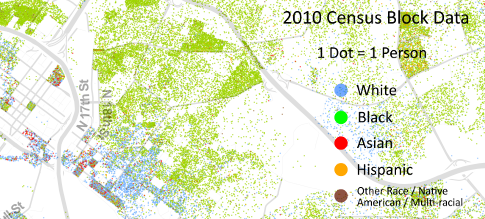
Map of 2010 census by density and race
08/18/2013 1:45 PM by John M
Fascinating map from RVA News:
Dustin Cable, a researcher and statistician over at the Weldon Cooper Center for Public Service at UVA, recently released a colorful map of the United States based on the 2010 census data.
But these are no arbitrarily chosen and positioned colors. In this case, the map contains 308,745,538 dots (purportedly; I didn’t count ‘em), each of which represents the ethnicity and relative location–accurate to roughly the size of a city block–of every single person in the country. Dang!
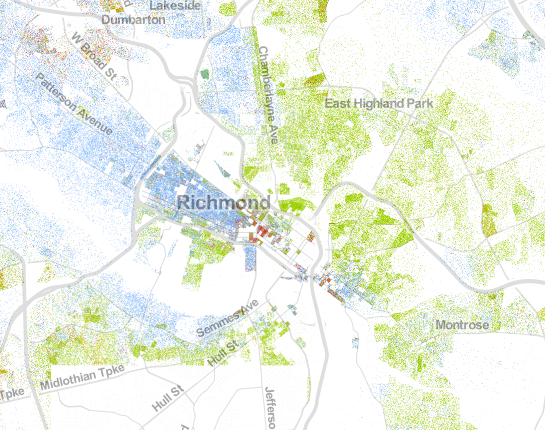
Funny how the recent incidents which has brought back the old battles of NOB and SOB – here the map shows racial demographic differences. White SOB, Black NOB and West of Chamberlayne. There is blending around perimeters but the map in a distance shows definite boundaries.
For those unfamiliar with the term SOB vs NOB = South of Broad Street vs. North of Broad Street, often referred to Sobs versus Nobs.