RECENT COMMENTS

New houses and more in the works for Sugar Bottom
Jonathan Spiers at Richmond BizSense has a good look at what’s up with the new houses in Sugar Bottom and what else is planned for the area:
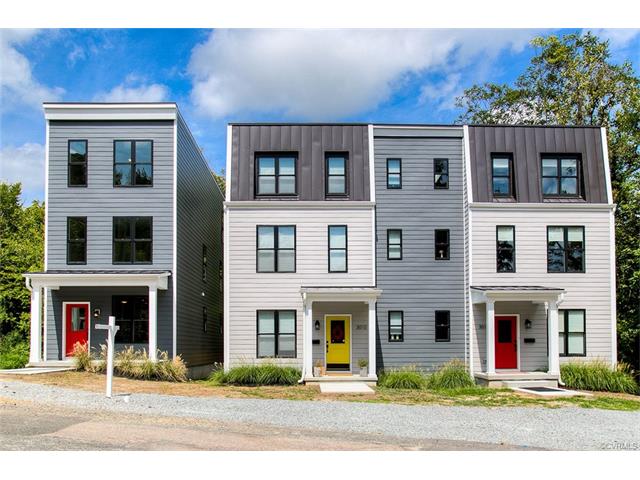
The first new homes to be built in decades in the neighborhood’s Sugar Bottom area have been sold and are now occupied, with more on the way.
The three modern-style row houses at the foot of East Franklin Street, just downhill from North 29th Street in a valley between Libby Hill Park and Chimborazo Park, are the first of several residential projects planned for Sugar Bottom, an area known historically as one of Richmond’s Civil War-era red light districts.
The block of houses and apartments down the hill from Libby and across from the eastern end of the Church Hill Train Tunnel was the site of a triple homicide in 1994 (“Richmond’s worst year”).


So plain, with no curb appeal. Just for the builder make more money.
I rather like ’em. More mature landscaping and a proper sidewalk will go a long way.
Very nice. In keeping with the historic style of the area, but without being “faux” historic. Beats the heck out of the modern, boxy apartments that were built not too far away.
Henry – I don’t think you understand how much cost is involved with building especially in the city (we learned the hard way). Curb appeal and interesting styles cost a lot of money. I personally enjoy seeing new developments pop up because it means people are working, businesses are growing and people are affording new futures.
Agree with SA Chaplin, they look clean without being boxy. A cleaner design almost always looks better than a design that has been micro-managed to look more historical. Credit to the architect and architectural review for making these look older from afar while clearly looking new closer up.
What the hell is sugar bottom?
Is this a tribute to Queens "fat bottom girls" b/c that would rule
A little area down from Libby Hill. Was a Civil War era red light district.
I’m not sure how best to word this, but: These houses are shaped like traditional row houses – but row houses are supposed to have a style or decorative scheme of some sort. Although these houses have some of the functional/decorative components of the historic homes in the area, these functional components (Water table/cornice, bulkhead/endwalls, porches) are stripped of any decorative aspects, and there are no purely decorative elements on the homes at all. Consequently, they look boring and a bit cheap, especially compared to other homes in the neighborhood. Which is unfortunate, considering buyers paid $400k or more for these houses.
I think the real problem is that contemporary architecture is so heavily focused on functionalism that contemporary architects have stopped using traditional decorative themes/schemes and haven’t cared to create any new styles to replace them. (Why would they? functionalism seems to imply that decorative elements are superfluous). I’d love to see homes like this in the neighborhood with some sort of new/contemporary decorative scheme, rather than more homes that reject the decorative arts all together
I agree with Henry. They’re plain and boring, but since this is a hot area, they’re surely sell. Even at that bloated price.
Huh, Sugar Bottom. That used to be my stage name.
I like your style Erik.
I agree with 3 and 5. These are one of the better in fills by a long shot. The in fill at the end of Marshall St. is a good example of bad.
Nothing has curb appeal when first built!
I think they look great. New construction in Sugar Bottom by the wrong builders could’ve been really bad.
And Henry, “plain” builder grade would have cost a LOT less than these did. I recommend finding pictures or going to the open house.
Look no different than the apartments near McDonald’s.
I agree with many above, this are very plain and no character. They do not fit into the quaint Church Hill. Really fakes away from the charisma of the area. I’m certain the designer could’ve had a better imagination.
Sugar Bottom?
While I’m not an architect/designer, I do think they did a great job with these houses. They took a chance and made something much more contemporary than the standard Church Hill infill and it paid off. I especially enjoy the nod to a mansard roof. There’s nothing quaint about their location, so it’s a perfect opportunity to do something a little different.
I’m curious if this will lead to more development on that vacant section of Franklin/31st. Could be nice to bridge the gap between the Hill and the Capital trail/Rocketts, etc. Does anyone know anything about the large warehouse/industrial building right?
It’s always the people who do the least that criticize and complain the most. Backseat architecture critics that line to tell everyone else how to spend the money they’re investing in our community.
If the architects/builders would have built on faux-historicism, none of the uptight Church Hillians would’ve been the buyers. They need the modern and fresh design to pull in more adventurous buyers to Sugar Bottom.
John Murden Jr. Well, that explains the name…
Until recently I wasn’t aware that area even had a name.
I once learned from an old timer that Sugar Bottom got it’s name because there was a sugar warehouse there. Thus the name
Why all the hating on architectural diversity? It is a hallmark quality of most (if not all) tier 1 cities across the globe.
You may disagree with their style based on your personal tastes, which is fine. But I hope the community acknowledges that they actually adhere to academically-accepted architectural schools of thought. (https://en.wikipedia.org/wiki/Modern_architecture)
Furthermore, the “lack” of ornaments is a key feature in such approaches – if a design feature has no functional value, it should not exist. Google Dieter Rams, who explains this well and cites Apple’s design philosophy as adhering to this. I do recognize this is mostly for industrial design.
So, net-net, while I may not personally care for the modernist/post-modernist look, at least represents a creativity that does not include frilly scroll work and dandy boy fanciness.
Mark – Agreed!!
This blows my mind. Especially because we had friends who lived in the extremely low income cinder block quad apartments directly across the street. $400/ month, the only windows were about 2 feet from the ceiling and the size of a pie plate. The walls were concrete. Roaches and mice ran rampant. No washer and dryer, hazardous electrical and a haven for mosquitos….. seeing this 400k pricetag across the street is mind boggling. As for the families living in those quads, where would they go? Where else can you find cheap housing? Voucher waitlist is a year long, single working mom wants to keep her kids out of the housing projects but there are extremely limited alternatives. These are the untold tales of gentrification.
way better than the freaky/cheap barn siding/cement panel, fake modern stuff
@ 24 / Objectifier – that’s the problem, though. It’s really a matter of expectation. Think about it this way: Traditional row home and townhome design usually takes advantage of the fact that rowhomes and townhomes have very little streefront exterior which can, consequently, be heavily decorated, while the sides and the back are quite plain. This makes a cohesive and extensive decorative scheme possible even on middle class and some working class rowhomes and townhomes. Because ornamentation is what is customarily done, a house without the decorative work looks totally naked. Or just really cheap.
Alternate consideration: a lot of the modernists you reference weren’t particularly into or known for small scale urban homes. They either built massive tower blocks or large private homes in the city or suburban and rural homes. (It’s hard to generalize here, because modernism covers such a wide range of architecture, but I’m sure you get my point)
Anyway, I wouldn’t call the Sugar Bottom Houses ugly, but they aren’t pretty either. But I will say, in fairness, that they look like they might age better – from both a durability and aesthetic perspective – than a lot of the really modern structures that have been built in the area.
Love the modernization of of the old school church hill, with just a few ornamental trees and shrubs would do wonders for curb appeal. Sure the new owners will pull it together.