RECENT COMMENTS
Eric S. Huffstutler on What is up with the Church Hill Post Office?
Eric S. Huffstutler on What is up with the Church Hill Post Office?
Yvette Cannon on What is up with the Church Hill Post Office?
crd on Power Outage on the Hill
A slice of West Broad on Mosby Street?
05/14/2009 1:00 PM by John M
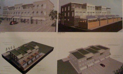
The owner of the property at 715 Mosby Street and representatives from Cornerstone Architects presented a design for the former KFC at Wednesday’s Union Hill Civic Association meeting.
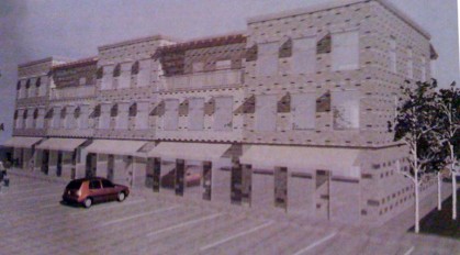
The rendering is pretty much the same as on the sign out front of the old chicken restaurant. The design is for a mixed-use development, with retail/commercial on the ground floor and residential space above.
Echoing earlier comments on this site, the discussion at the meeting centered around the street-side parking lot and it’s inappropriateness. It was unclear to as to how receptive the developer was to the opinions presented.


The thought of the parking spaces out front makes my heart sink. We can fight this wrong-headed concept with the help of R63 zoning (which discourages a street-front set back for parking spaces). Our city planners in Community Development need to hear from folks who hate this parking lot site plan. Commercial development of the site is welcome, and teh scale/mass of the buildings looks pretty good. Just not with the street front parking.
If there was ever a reason to pass the ordinance creating the Union Hill Old and Historic District, this project is it. Just think what CAR would say about this design and the parking situation.
why is the car reflected on the front of the building – is the front mirrors? This thing is so bad it is hard to know where to start
Do you think they even considered the concept of moving the parking to the rear?
The design could work very effectively with existing on-street parking and a continuation of the sidewalk/walkway theme that reflects the flow of these old neighborhoods and direct over flow to the back – a separate parking area for patrons and dedicated parking for the tenants would be a nice perk for buyers. Especially so, if you were considering buying in a development that had a lot of transient customers.
The walkways from the sidewalk, with landscaping on either side, could flow just like our walkways flow to our doorsteps – right where they needed the customers to go – to the stores.
With no drive in parking out front, like you see at let’s say, a 7-Eleven, there would be less people hanging/lingering by the store fronts making the place less desirable to visit as a customer much less live in.
I hope that they wouldn’t think people would be so lazy as to not want to walk around to the front?
I love the idea of the investment that they are making in the community.
Deanna #4, I do not love the idea of the investment they are making in the community. I think the design sucks, to be honest, and just because someone wants to develop something does not nec. mean they want to ‘invest in the community’ – it means they want to make money, preferable the easy way.
And your comment about existing on street parking – have you actually looked at it? I don’t think there is any, but I’d have to drive over there to look to be sure. I think that that area of Mosby doesn’t have any parking on street at all, but again I’d have to look.
I have to agree with Doug #3, it’s hard to start it’s so bad.
I agree with #4 deanna. An investment in the community is a good thing. Let’s not flattly oppose this dealio – as is so often done on the hill.
True, the mirrored windows and parking in front suck for this location, but I don’t think that should kill the whole project – nothing a little tweaking can’t take care of.
I want a Hollywood / Fan video or equivalent and some kind of quick deli sandwich or fast food to compete with the micky d’s in the bottom. Put em in.
It also looks really huge – is the lot actually big enough to accomodate all that? It looks so much wider than the former KFC building.
A successful example of how parking in the rear can work is down on Main St behind Aziza’s and the Mcquire Park Pharmacy. The parking spaces are behind the buildings, it’s well landscaped and both businesses have rear entrances that are inviting and safe.
i thought that the sign was a joke, but maybe not. is lsd making a comeback? third world transitional style blends well with penitentiary city residences across the street. are cornerstone architects really licensed in virginia or are they part of a polychrome & mirror diversity experiment from mars?
RE: “I hope that they wouldn’t think people would be so lazy as to not want to walk around to the front?”
Look at it this way, who would be so stupid as to leave their car parked in back of this lot, hidden from view of all save the hoodlums who are waiting to break into it?
That’s why they didn’t put the parking in the rear.
How successful will a shopping center on Mosby really be? Sure, we’ll all know about it, but how many average Richmonders will be happening to cruise down Mosby and see some shops they want to stop to visit?
You don’t have to drive too far down Mosby Street to see the problems caused by an asphalt parking lot on the front of a commercial structure/convenience store. This design is in conflict with efforts to make Union Hill more pedestrian and bike friendly, and is frankly out of character with the neighborhood.
Issues of secure parking can be addressed through appropriate design and management.
The developers were informed in January that the community would object to parking in the front of the building. The developer stated he wanted community input, then blatently ignored it.
The idea here is to design a structure that will take us forward, something that we will be proud of and contribute to the neighborhood 25-50 years down the road. Not something we will want to bulldoze in 5 years because the design directly conflicts with the surrounding neighborhood.
Who in the heck is going to want to live there? How much will the rent be? Please don’t tell me they want it to be condos – who would buy a unit?
Hey Stretch, I agree “as it is” parking behind that little shack is like giving your car away. A successfully laid out plan can eliminate those problems. Well lit, controlled access, security cameras, etc. Right now it is a vacant lot, grass growing through the cracks of concrete, with a little building on it.
You’ve definately got the creative eye to see the potential. Imagine a well laid out “stretch”, no puns intended, of buildings… a block. Shops below like in NY and apartments/condos/what ever they are proposing on top. There appears to be units with fenced back yards. Those living there and above looking over would be watchful.
What if the entire area was nicely fenced with well lit routes in and out of the resident and shoppers parking area. Well lit, controlled access, egress, eyes above and below… doesn’t have the same feel as a vacant lot with a tiny chicken house on it.
Change has got to start somewhere. A design like the proposed above looks to me like a strip mall.
…………….
crd – I agree – the design sucks. I have looked at the street parking. I”m not saying tha ALL of the parking would be thre… just that the development could also utilize the street to keep the “feel” of these neighborhoods.
UnionHill – you are right on the money! Perfect example.
Part of the problem is unshackling people’s minds from suburban development principals. The developer (just guessing) may think this totally urban because of how the building looks, but doesn’t realize the site plan and configuration destroy any urban and pedestrian feel.
On the other hand, if this property is still in under an older suburban-style zoning district (also just guesing) there may be a setback that City is requiring. So old zoning may be at cross purposes with what the neighborhood would want. This is happening in many places in the area, just guessing that may be a factor.
This looks like an Urban Business zoning would be perfect for this project if they could just sidle the building up to the road. The scale and facade differentiation look ok… we’d want to get a better look at the finishes.
oh, goody…a strip mall right here in downtown richmond. and the owner states his desire to include a convenience store and a laundromat as part of the offerings.
blah
I am working with the Architect on this project and I want to clarify several points.
1. This project was initially designed to meet the existing zoning, which was B-2 and required 25′ setbacks, hence the front parking. Both our firm and the client were surprised by this change, and we have been working to adapt our present scheme to meet the new zoning regulations which are not even in place yet.
2. Our firm is an award winning, small, well-respected, and fully credentialed firm. We are sensitive to the fact that the community has a vested interest in the project and are working with the owner to adapt our scheme.
3. It is our understanding that by the R-63 zoning laundry facilities and convenience stores are among the allowed uses, and therefore were the uses suggested.
Why not ask Planning for UB zoning for this property? It’s not too late.
hey C. Selden,
Thanks for commenting and explaining the parking lot out front.
Apologies for saying that your design “sucks” in such a broad way. The building layout is cool, I like the traditional shape/scale of the structure and the staggering of the facade. The set-back and “strip mall” feel was my issue. That sucks 😉
In new construction tried and true formulas seem to win over because they are cheaper but often they are not unique. Go to almost any city in America and you can see that this country has morped into the same Best Buys, Target, Sams Club with their surrounding drive-thrus and chain restaurants. This little part of the world IS that charming town that people will flock to because it is so different, because of it’s history.
Laundry, convenience, video stores, and a place to eat are great ideas for tenants in my opinion. Good for the residents (high rises in Northern Va/DC have the same amenities)
So, with R-63 will you be able to give the design an older shop feel and push the parking to the back?
Thanks!
Greetings to all, I along with one other partner of BRD attended the Union Hill Civic Association meeting along with our architect and designer and I am, quite frankly, a little confused. Our purpose for going to the meeting was to show our plan and get some feed back and then our intention was to re-design and try to accomodate some of the opinions and sentiments that we heard. I immediately requested that my architect and designer, both licensed in the State of Virginia with an office on Broad St. in Richmond, scale the project down and re-design by moving the buildings closer to the street, move the parking from front yard to side yard,install green space in front, make it more “pedestrian appealing”, provide a space for bicycle and scooter parking and lastly give the building a more traditional look. We now have a new version of what we would like to do and I will e-mail a copy to the association President for comment. I think the changes that we have made reflect what I heard from the comments of those attending the City meeting on the proposed zoning changes in Union Hill and as well from those attending the Union Hill Association meeting last week, both of which I attended.