RECENT COMMENTS
Joel Cabot on Power Outage on the Hill
Eric S. Huffstutler on What is up with the Church Hill Post Office?
Eric S. Huffstutler on What is up with the Church Hill Post Office?
Yvette Cannon on What is up with the Church Hill Post Office?
crd on Power Outage on the Hill

Proposed for Franklin Street
07/15/2014 3:51 PM by John M
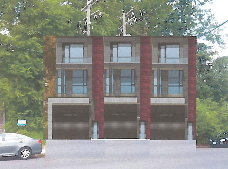
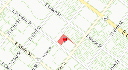
One of the items on the agenda for the next CAR meeting on July 22 is the conceptual review for five new single family dwellings at 2400 East Franklin Street (PDF) (located between the stairs and a small parking area on Franklin Street).
— ∮∮∮ —


Looks great and it has parking which is an issue around there. Its nice to see infill with more modern design
Hmm. Kind of playful looking but I’m not sure what part of the neighborhood they are referencing with the garage doors!
Ugly as sin. CAR should love it.
There’s no place for a prominent garage like that in a historic district.
Hmm. On one hand, I appreciate the attempt to address parking concerns, but I have to agree with Alex. Kinda ugly & those garage doors stick out like a sore thumb.
Alex, I agree, the garage doors are ugly.
Has anyone else clicked the link and looked at the plan view? It looked to me as if maybe there are two other dwellings behind these three. Not sure how they are accessed, as I t think 24th St. does not go all the way through. (But given how confused I was the other day about which side of the street these were on, I could be wrong!)
Gotta vote against this. Alex is right. Some time CAR has got to step up to the plate and say no to such an industrial looking building in an historic area.
Given how industrial Franklin St is on that block, I don’t hate the surface level garage doors as much as I would if this project was somewhere else. If they could configure the property similar Sterling Row on N 19th, then that would look better and it would mean more street parking. However with the topography and limited space on the lot that may not be useful.
As for the “where are the other two dwellings?” Question: It appears two attached dwellings are behind the three shown in the rendering, which is why mimicking Sterling Row would be advantageous.
Actually, in re-considering the exact location of these, perhaps the garage doors could work if there were two rather than three. These are right across the street from some pretty large modern buildings. Kind of amazing that an architect would not even try to put on a ground level porch. This is what conceptual review is for though, and this seems to be an architect who is either unfamiliar with what makes sense in an historical urban setting, or has a client who is unfamiliar with historical urban settings!
Epic Fail. This falls into a historical district and per their guidelines is supposed to fit in with its surroundings. I see nothing “modern” this mimics (minus the parking deck) in the immediate area.
Eric, you need to look harder…
http://en.m.wikipedia.org/wiki/File:Dumpster-non.JPG
There’s plenty of these around the area that the garage doors coordinate with quite nicely.
Alex 🙂 The blue adds a bit of color in the area (you know I’m being facetious).
I know they are trying to utilize space efficiently and have to give them kudos for that but obviously have no regards towards historical surroundings. Look at their submission – handwritten rather than typed in. A bad start towards showing they are seasoned professionals.
I cant believe this is even a developable lot.
The other two are positioned on a 45 degree angle. I’m thinking it’s the only way to fit them all in, but just seems weird (why not make them narrower, or a different shape, or something?)
The surrounding buildings are industrial/warehouse style. A conventional residential home with a porch would look even more out of place than something more modern. Not a huge fan of all the steel but for the area it’s not terrible.
Yeah, think of drainage, mud, land slide issues.
Yeah, I guess I’m really not understanding how that is even a buildable lot. How are they going to excavate to make a foundation without destabilizing the entire hillside??
The design looks like one step beyond cocktail-napkin territory, we really need elevation perspectives to give us more info about how these buildings work (like, the back two that are at a 45 degree angle–are those on a higher elevation/retaining wall?)
That being said: I actually think the first-floor garage idea is great–makes parking a non-issue, and it pops the building up and allows for fantastic views on those second and third stories. put some rooftop decks up there and you’re gold.
I imagine these are two rooms deep, maybe? 2 BR? perfect for a single person or a couple. No yards to deal with. I cautiously dig it.
@16, I agree they’re one step beyond bev naps sketches. I can’t figure out how the two in the back get in and out – 24th St. doesn’t go all the way through to Franklin. Good point about excavating the hillside, too.
As for the garages, I don’t agree, I think they’re ugly and not in keeping, and they will have to go pretty high up to have a view – aren’t the buildings across the street four or more stories high?
I remember the hue and cry when the condos on the SE corner of 25th and Franklin were built. But now that we’ve had time to live with it, it’s not so bad after all, is it?
I don’t have any problem with the design of these units. I might view the garages as a security issue but then again, I’m not going to live there.
Mindy, I am not saying put a Victorian or Italianate house on the block because that would look out of place. But design a 1880s-1920s style business like or factory front building similar to what are on the street. And no, I have not gotten use to the building on the corner attached to the ABC Store. It looks like a drunk coming out of the store designed it with all of the odd angles, mismatched building materials, and that horrid corrugated metal siding.
In other words it needds to be an old school brick front warehouse, factory, business building with underneath garages. Not something kitsch or trendy for now. It has to stand the test of time as well as fit in to the immediate surroundings.
I don’t know, I think that trying to build a new structure that looks historic can miss the mark more often than not. I’d rather see something contemporary but tasteful than a bad historic fake.
There is definitely room to add a historical touch with the garage doors though. Some old industrial doors could be cool.
There needs to be some thought on the interaction of the garages with the sidewalk on Franklin Street. The garage to sidewalk orientation is typical of what you would find in the suburbs. It’s not pedestrian friendly.
I would suggest one garage door opening where all the units have shared parking on the 1st floor. However, I realize this parking option may impact the townhouse lot concept and be more suitable for a condominium project.
I’m reading the garage-to-sidewalk relationship as something similar to what you would see in San Francisco (NOT the architecture or proportions, but rather the placing of the garage space on the primary level, with upper stories for living, done in a tight footprint)
I agree with @21 ~ it’s far too easy and sadly far too common to miss the mark on making something appear historically-appropriate (we all have our favorite neighborhood disasters as far as that goes). I think it’s much better in the long run to design something contemporary while at the same time incorporating some materials and motifs that allow the new building to weave itself into the overall neighborhood fabric.
Underground tunnel parking lot for the building? 🙂
I was going to say George jetsonesque rooftop air car parking, but Eric’s suggestion of train tunnel parking more appropriately references the indigenous built environment.
There will have to be some major re-working of the power and phone lines. Two large poles sit directly on top of the proposed site, in line with sidewalk (although there aren’t sidewalks there).
I really don’t understand how these are going to fit on this lot…
I had emailed Catherine Easterling for more info on this proposal. I think the guy is ambitious but clearly has not done his homework.
Mud slide issues… Eric PLEASE get into standup!
Where were you parking winers folks when the “Theatre Nightmare” was in question on the Shady Side of Broad???? Stop Josh Bilder!!!!
Reavis, sorry… I am all for the theater project and know he has bent over backwards making changes and changing architects over the course to try and keep the peace with residents.
That said, yes… if you remember during hurricane Gaston, there was a landslide on E. Grace Street so could happen anywhere a steep hill is:
http://upload.wikimedia.org/wikipedia/commons/1/16/Hurricane_Gaston_landslide_damage.jpg
I have heard from Catherine Easterling at CAR who was very apologetic the delay and gracious to follow up with me about our concerns about this property.
Apparently this is a “conceptual” drawing only submitted for review and not what is voted on. This allows the CAR to make suggestions for changes.
The developer has withdrawn the design and the CAR has stated that : “My staff recommendation to the Commission notes that the first-floor Franklin Street garage entries, the lack of front doors, the patterning of the windows, and the siting of the five houses is inappropriate and should not be approved.” They will also be reviewing the hill grading issue and any retention wall as well. That the owner/developer will be resubmitting changes for the August CAR meeting.